- Open today, 10 am to 5 pm.
- Parking & Directions
- Free Admission

August 6, 2020
The History of Art in Color
Modern Color: The Electric Rainbow
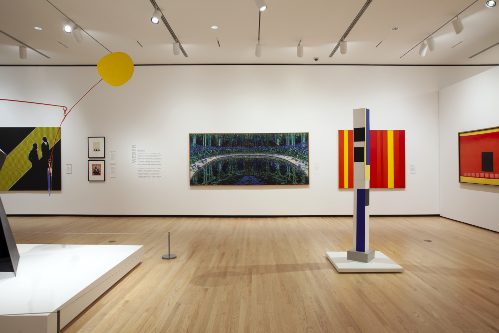
Modern & Contemporary Galleries, Summer 2020.
A Colorful Past
We take for granted how colorful the modern world truly is. Centuries ago, color was an expensive product reserved for those with privilege and purchasing power. As detailed in Blue on a Budget: The Economics of Color History, the price of art materials was once the subject of contract negotiations between a painter and patron. Artists were limited to what they could afford or what a patron was willing to pay. Precious pigments like ultramarine blue and carmine red were often applied with great care and economy, painting only a final layer as a thin glaze on top of other less expensive colorants. This economy of color also meant that brilliant and costly colors were more often applied only locally to specific areas of the composition. Francesco Botticini’s Adoration of the Magi in a Landscape (late 1400s) showcases this. In a typically early Renaissance style, the composition lacks overarching chromatic unity, instead opting for distinct punches of color in the figures’ robes. These punches of color are truly jewel-like, not only in color but in their great cost.

Francesco Botticini (Italian, 1446–1497), Adoration of the Magi in a Landscape, late 1400s, Tempera on panel, Gift of the Irene Leache Memorial Foundation, 2014.3.2
Do Not Adjust Your Screens: The Colorization of the World
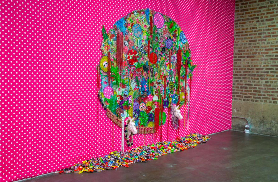
Ebony Patterson (Jamaican-born, active in the United States, b. 1981), …she loved animals said she wanted to take care of them when she grew up… (…when they grow up…), Hand-cut jacquard woven photo tapestry with beads, appliques, broaches, glitter, trim, fabric flowers, unicorn heads, and candy, on fabric wallpaper, Museum purchase with funds provided by Rebecca and Mark Dreyfus, Penny and Peter Meredith, Meredith and Brother Rutter, Christina Goode, Susan and David Goode, Oriana McKinnon, Dee and Harry Lester, Suzanne and Vince Mastracco, and Claus Ihlemann and Robert Roman, 2020.1
Works like Ebony Patterson’s she loved animals said she wanted to take care of them when she grew up… (…when they grow up…) now burst with electric rainbows of color. Her work exemplifies the colorful nature of our everyday lives, being largely composed of readily available, low-cost items: a machine-woven jacquard photo tapestry, printed cotton fabrics, Mardi Gras-style party beads, and miniature candy bars.
The colorization of the world was a slow process that rapidly accelerated in the nineteenth century and exploded into rainbow highs during the twentieth century. This was made possible by the discovery of synthetic pigments and dyes that now dominate both our world and the palette of the artist. These pigments are deeply ingrained in our everyday products from plastics and paints to textiles, inks, foods, and cosmetic products.[1] Yet, hardly any of us are likely to have heard of these colors. The most important of these colors are the azo dyes, the phthalocyanine pigments, and the quinacridone dyes. They are often sold under a range of trade names like carmosine, red lake C, red no. 4, or fanciful private-label names like Dragon’s Blood Hue.
Of all the synthetic pigments on the artist’s palette, 80% are azo dye pigments. Their ease of preparation, low cost, and wide range of color have made them extremely popular and readily available. These organic pigments are derived from the organic synthesis of coal and oil distillates. When these dyes were first created in the mid-nineteenth century, they were called aniline or coal-tar colors.[2] Azo dyes are now synthesized in red, orange, yellow, blue, violet, brown, and black,[3] but the most popular color of the nineteenth century by far was the famous purple Mauvine. Most azo colors used today in artists’ materials are yellow, orange, and red.[4]
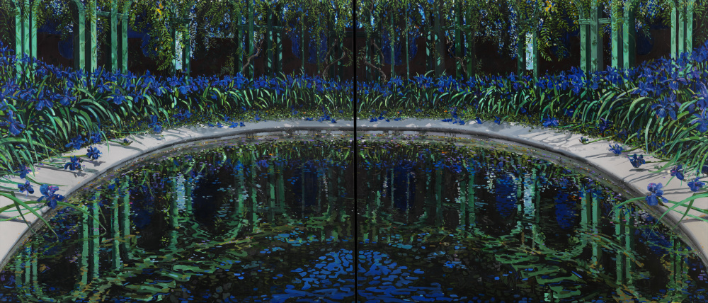
Yellow azo dyes are distinctively chromatic; it’s a shade so brilliant it’s hard to miss. Think of the ubiquitous yellow food dye tartrazine (yellow no. 4), first patented in 1884. [5] In addition to tartrazine, arylide “Hansa” yellows were, and remain, a popular color choice for paint. They replaced earlier yellow colors like Indian yellow that were costly, of low chroma, and faded over time. Our untitled work by Michael Drought appears to showcase this distinctive hue of arylide yellow that is not achievable with metal oxide pigments or natural dyes.
Michael Drought (American, b. 1946), Untitled, 1980, Oil on canvas © Michael Drought, 81.28
Light and Color: Fleeting Brilliance vs. Enduring Permanence
Despite their chemical origins, early aniline (azo) colors had notoriously poor lightfastness, and this did not slow their introduction into artists’ materials.[6] For instance, the fugitive azo dye lithol red can be found in the works of Mark Rothko, including his 1962 untitled Harvard Murals.[7] Despite Rothko’s obsession with modern color, these paintings have faded with time, just as the Old Master works before them did. In 2015, the Harvard Art Museum displayed the Harvard Murals as they would have looked originally by color correcting them with projected light. Our own Color Field work from this period of artistic expression, Oppositions by Guido Molinar, may too contain these popular but fugitive red azo dye pigments.
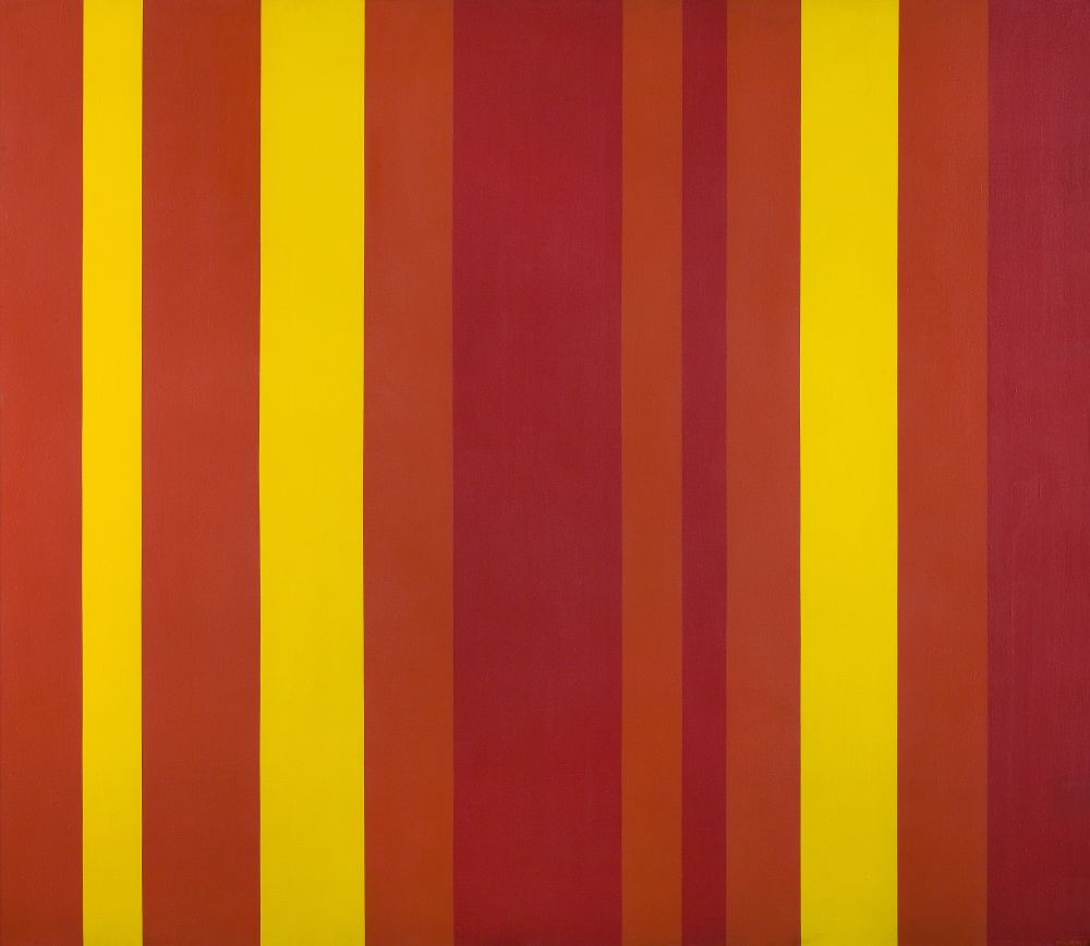
Guido Molinari (Canadian, 1933–2004), Oppositions, 1961, Acrylic on canvas © Estate of Guido Molinari / Artists Rights Society (ARS), New York, 71.892
As early as the 1960s, other lightfast red azo pigments were developed,[8] but another family of permanent red dyes had truly come to the forefront. In the 1950s, color technology found a major breakthrough with the synthesis of the quinacridone dye colors. These were the first modern transparent reds with outstanding light stability.[9] Lightfast azo and quinacridone pigments now replaced historical pigments like the ephemeral alizarin crimson and Indian yellow or the toxic red vermillion. These contemporary replacements for historical pigments are often denoted by the addition of “hue” on the end of the name, as in vermilion hue.
For blues and greens, another family of colors was synthesized in 1930s. A happy accident, pthalocyanine blue was created followed by green. These inexpensive and non-toxic pigments are the predominate blue and green of the world, accounting for 90–95% of green and blue pigments used in paint, printing inks, and plastic.[10] They are also outstandingly lightfast and stable,[11] making them ideal for the artist’s palette. These colors are often sold as phthalo green/blue (the “ph” is silent), sap green, or permanent green. The phthalo colors have a distinctively rich hue that cannot be missed in Idelle Weber’s Color Lesson VI.
Idelle Weber (American, 1932–2020), Color Lesson VI, 1984, Oil on linen, Gift of Kitty and Herbert Glantz, 2015.9
Color as Art: The Medium is the Message
As elucidated by the titles Color Lesson VI and Zinc Yellow (Franz Kline, 1959), color truly took the front seat in the creation of art. Post-World War II, Abstract Expressionism, and Color Field painting saw a shift from privileging artists’ ability to render realistic images to championing the materiality of art materials themselves. Rothko was one of the preeminent Color Field painters. Where others brought form into their works, Rothko’s pieces often exhibit a purely chromatic experience.
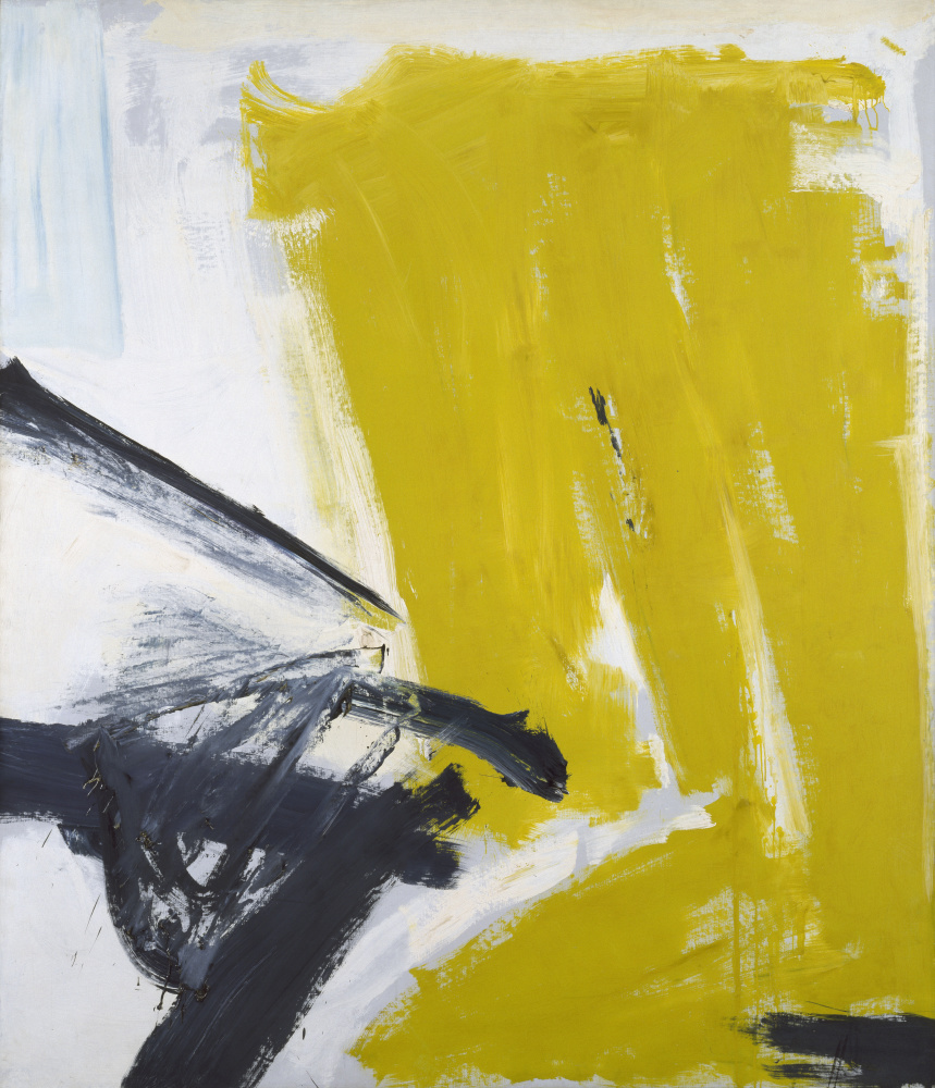
Franz Kline (American, 1910–1962), Zinc Yellow, 1959, Oil on canvas, Gift of Walter P. Chrysler, Jr., ©The Franz Kline Estate / Artists Rights Society (ARS), New York, 71.666
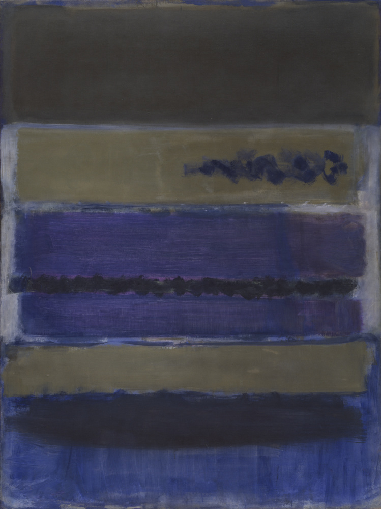
Mark Rothko (American, b. Russia, 1903-1970), No. 5 (Untitled), 1949, Oil on unprimed canvas, Bequest of Walter P. Chrysler, Jr., © Kate Rothko Prizel & Christopher Rothko / Artists Rights Society (ARS), New York, 89.54
These modern pigments also found wide use in other mediums, including the modern tri-color print consisting of an azo-arylide yellow, phthalocyanine cyan, and quinacridone magenta (plus carbon black).[12] The stability of these colors has allowed for inkjet printing to become the most popular means of producing archival prints. The process of creating true photographs (black and white or color) using light-sensitive papers has become an artisan practice as these materials are inherently more fragile and will ultimately deteriorate faster than modern inkjet archival pigment prints. Even historical photo negatives are now reprinted in this modern technique. The Necklace (1999) by Alessandra Sanguinetti showcases the quality capable of modern inkjet printing. The technique allows for the matching of the crisp resolution and rich chromatic intensity previously only available in color photographs (also called chromogenic prints) like Box of Color by Olivia Parker (printed 1982).
Example of deterioration of modern commercial chromogenic color photographs. Extensive color fading due to light exposure. (ca. 1990)
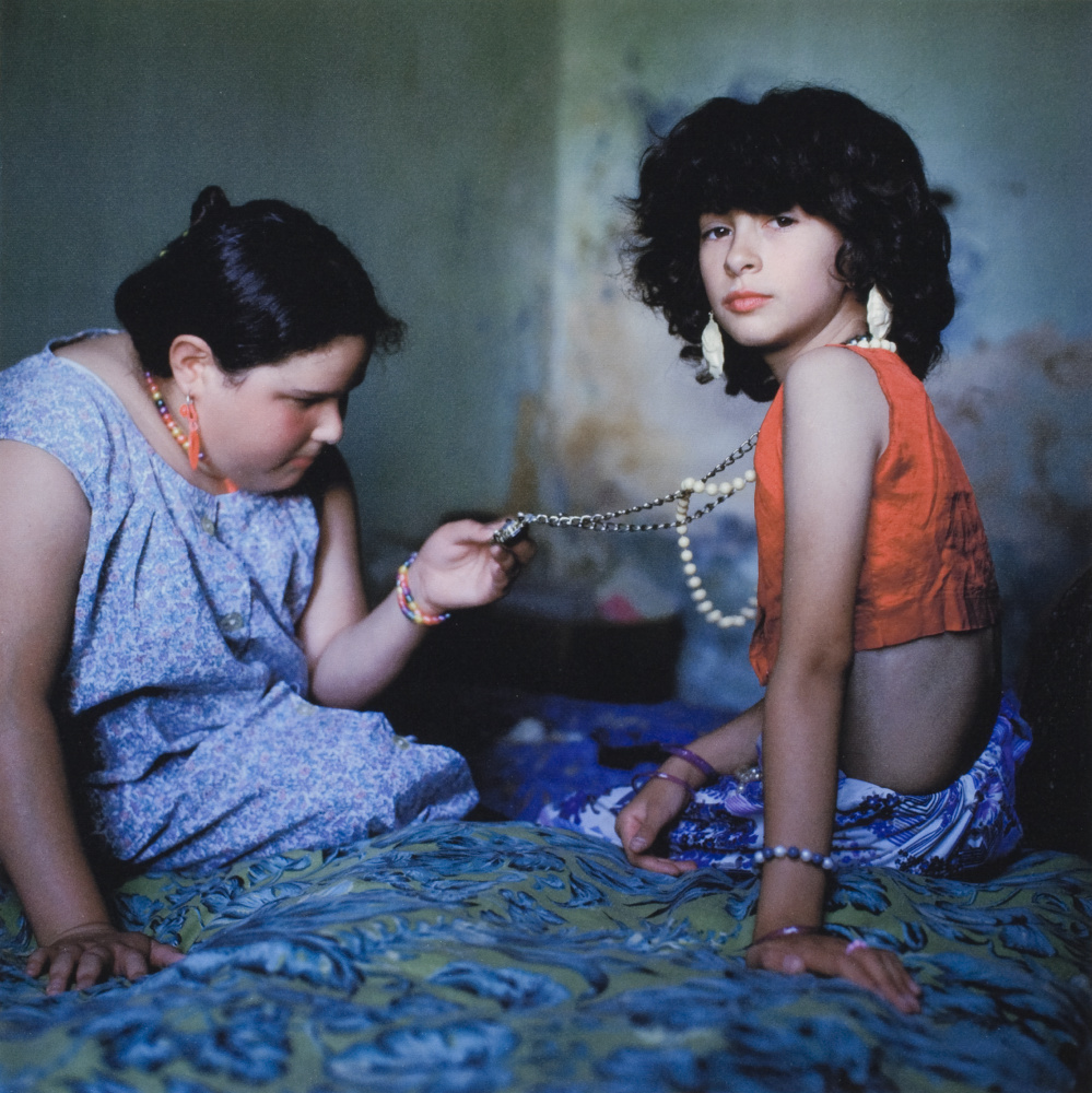
Alessandra Sanguinetti (American, b.1968). The Necklace, 1999, Pigmented inkjet print, Gift of Joyce F. and Robert B. Menschel, © Alessandra Sanguinetti, 2007.12.84
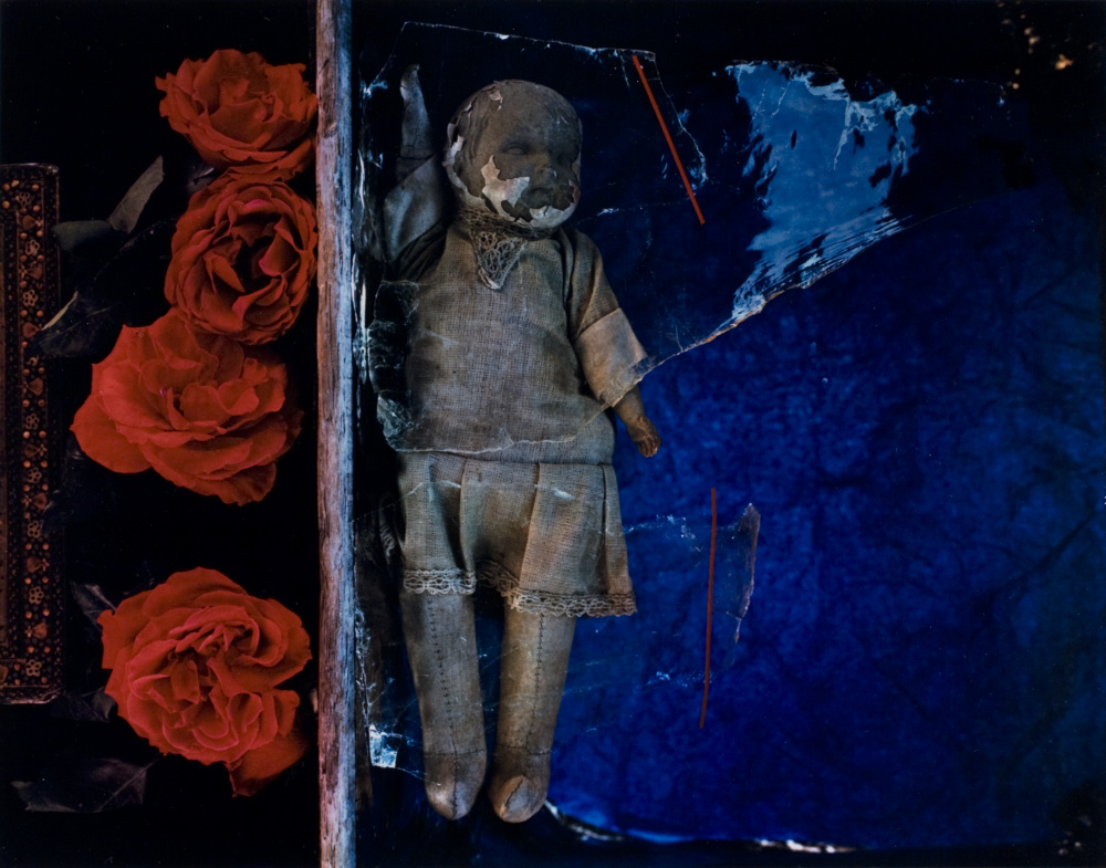
Olivia Parker (American, b. 1941), Box of Color, 1980, printed 1982, Chromogenic print, Gift of Joyce F. and Robert B. Menschel © Olivia Parker, 2007.12.75
A Groovy New Hue
The list of synthetic colors currently in use is expansive and growing longer each year. Several other organic dyes exist outside these families that make brilliant shades of red (perylene), violet (dioxane), blue (indathrone), and many more. Perhaps one last strange family that has managed to captivate us is worth mentioning though: fluorescent colors.
While fluorescent color has existed for millennia in the form of natural minerals and plants, synthetic, mass-produced, fluorescent colors really came into vogue with the psychedelic age and the formation of the Day-Glo Corporation in 1968.[13] Andy Warhol’s 1967 Marilyn showcases the colors of this era.
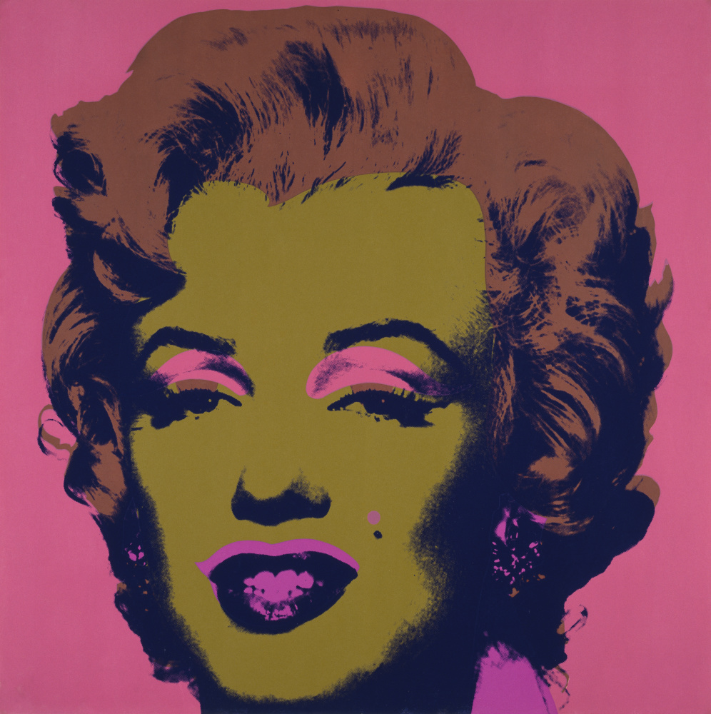
Andy Warhol (American, 1928–1987), Marilyn, 1967, Screenprint, Gift of Walter P. Chrysler, Jr © Andy Warhol Foundation for the Visual Arts / Artists Rights Society (ARS), New York, 71.2170
These electric colors defy boundaries because they both reflect and emit light, creating both subtractive and additive color at the same time. Fluorescent Day-Glo colors are often organic dyes of complex structure.[14] As with any color, they reflect the wavelengths of light we see, creating a base color. However, they look like a more intense color because they absorb other wavelengths as energy and reemitting them closer to the color of which they appear.[15] It’s the same reason why some of your clothes may glow in the dark at a night club under black lights. That glow is absorbed invisible UV light that is reemitted as visible light. Day-Glo colors add this subtle glow to their visible color under natural lighting conditions, giving them the intensified luster that we so closely associate with 1980s fashion. These colors continue to fascinate fashion designers and painters alike, as seen in the recent work of Peter Halley.
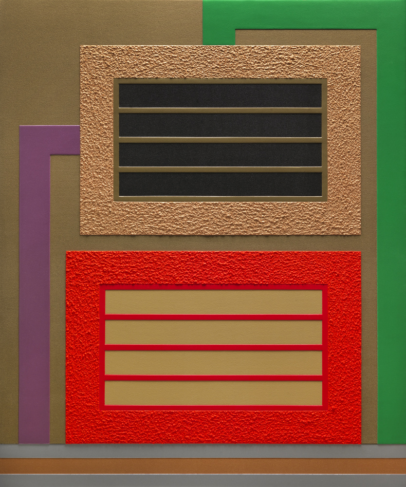
Peter Halley (American, b. 1953), Divide, 2011. Fluorescent acrylic, metallic acrylic, pearlescent acrylic and Roll-a-Tex on two attached canvases. Gift of the artist in memory of Amy L. Brandt (1978–2015), the McKinnon Curator of Modern and Contemporary Art at the Chrysler Museum of Art from 2011 to 2015, © Peter Halley, 2015.32
What a Wonderful (and Colorful) World
Modern color technology has truly transformed our world, and art making has not escaped this. Color was once expensive, rare, and even dangerous. Inexpensive and readily available organic colors now replace the expansive heavy metal or mineral-based pigments of the past, making art making accessible to nearly anyone, even young toddlers who express themselves through finger painting. While some materials, like the electrified Day-Glo colors, will probably fade with time, others now offer incredibly stable alternatives to the much-beloved but ephemeral colors of traditional art making. These new stable, modern colors find their place not only on the artist’s palette but also on the palette of the conservator, where they are suitable for restoring even the most valuable Old Masters at the Chrysler.
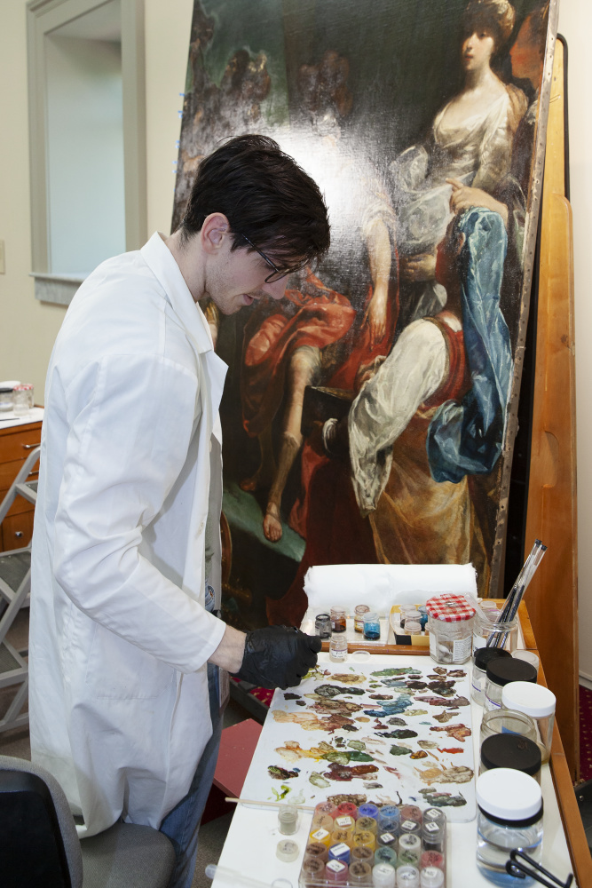
Brandon Finney, NEH Conservation Fellow, Conservation in the Galleries, 2019, Retouching with a palette of traditional pigments and modern synthetic dye colors. Guiseppe Maria Crespi (Italian, 1665-1747), The Continence of Scipio, ca. 1700, Oil on canvas, Gift of Walter P. Chrysler, Jr. 71.543
Bonus: All That Glitters in Not Gold – Mica Pigments
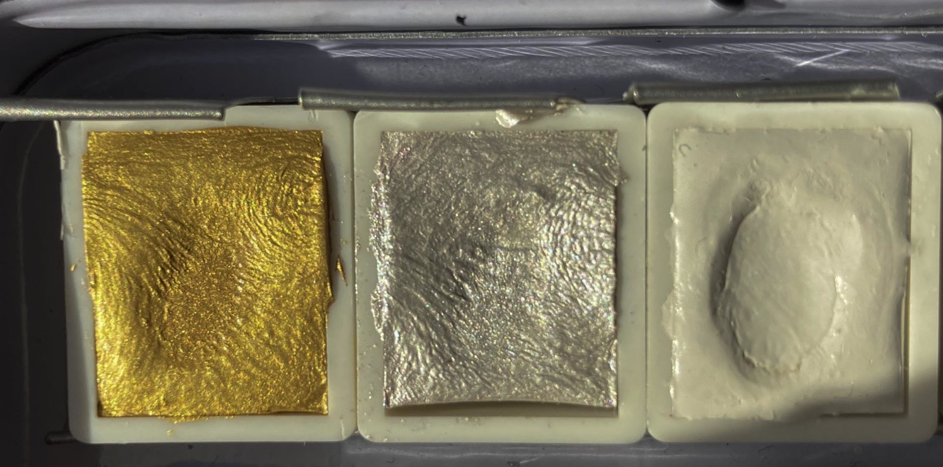
Mica-pigments: gold (iron-oxide and titanium dioxide coated) and silver (titanium dioxide coated) versus pure titanium dioxide white (right)
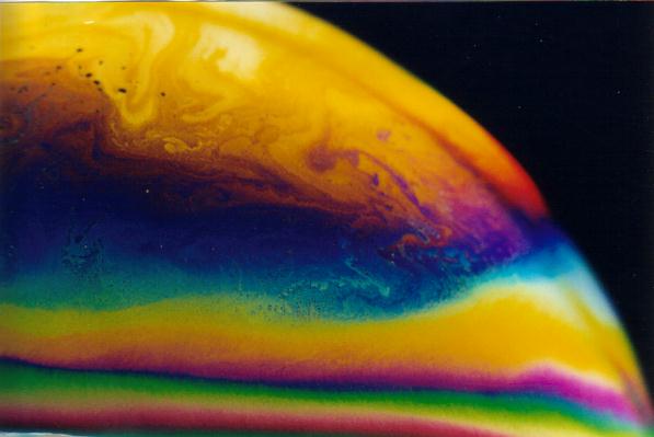
Mica pigments are one of the few mineral pigments that has not declined in use during the twenty-first century. These silica-based minerals area widely used for many commercial applications, but most of us will recognize these pigments as the sparkling sheen of makeup and paint (often seen on cars). Mica pigments gained commercial success in the 1970s when methods were developed to create this sparkling, pearl-like effect. Just like iridescent wings of a butterfly or bird feathers, these pigments create color effects through structural means. Rather than absorbing and reflecting color like most pigments, light is instead attenuated by its interaction between multiple layers of metal oxides deposited on the transparent, colorless mica core.[16] The choice and thickness of these coatings determine the color and the color-shift of the largely colorless mica. Titanium dioxide alone yields whitish sparkling pigments. The addition of an iron oxide layer on top of this, yields a gold coloration. Titanium dioxide is highly refracting, meaning it bounces light internally. When light touches the surface of these multi-layered pigments, some are immediately reflected while others penetrate the titanium dioxide, are refracted internally, and finally reach the inner mica core where some are reflected again. Eventually, they are emitted outward toward our eyes.[1] These two pathways of light then interact with each other to amplify and cancel out certain wavelengths of color, thus creating the glittery, color-shifting effect of these pigments. The effect is the same as seen in a soap bubble – a colorless liquid produces a rainbow of color based on the interreference of refracted light.
By Threetwoone at English Wikipedia – Transferred from en.wikipedia to Commons., CC BY 2.5, https://commons.wikimedia.org/w/index.php?curid=2666893
Although a recent development, these modified mica pigments are hugely useful for the retouching of even the oldest gilded surfaces. In the past, restorers had only metallic pigments available, often copper-based. These metal pigments become dark and dull and, as they oxidize, leave obviously discolored patches where a repair has been made. In contrast, gold mica pigments are highly stable, creating a retouching material that should remain concealed to all but those with a trained eye.
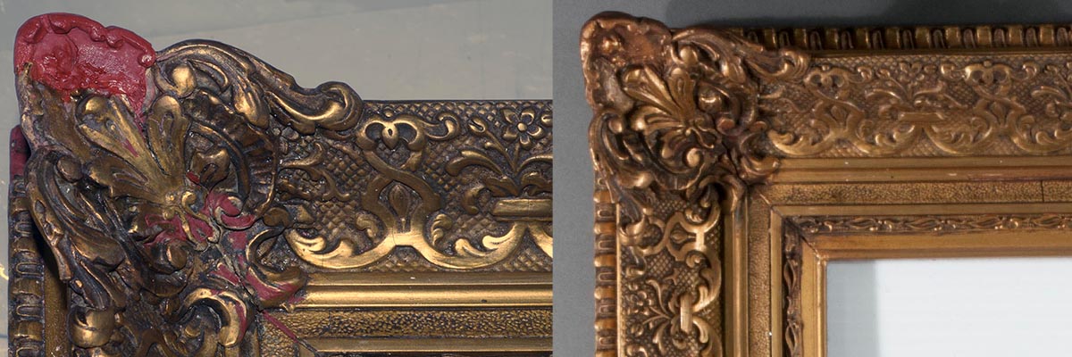
Before and after retouching with mica pigments. Red areas are new additions to fill losses to the original frame.
Afterward: A History of Art in Color
The Chromatic Tour of the Chrysler was developed to illustrate the fascinating history of image making. Great works of art reflect the period they were made in. Simply by looking, we can often read the influences of politics, style and society in an image. The material culture, that is the materials of art making and their availability, however, may not be readily apparent. The history of these materials played a critical role in the production of images by limiting and influencing the choices an artist would make to craft their works. The history of colors encompasses the gamut of technology and chemistry, mining, global trade, politics and war, economics, and health and safety. Each color has a unique story to tell in the history of art.
–Brandon Finney, NEH Conservation Fellow
Bibliography
Berrie, Barbara H, and Suzzane Q Lomax, ‘Azo Pigments: Their History, Synthesis, Properties, and Use in Artists’ Materials’, Studies in the History of Art, 57 (1997), 8–33 <http://www.jstor.org/stable/42622254>
Cramer, Werner Rudolf, ‘Examples of Interference and the Color Pigment Mixtures Green with Red and Red with Green’, Color Research & Application, 27.4 (2002), 276–81 <https://doi.org/10.1002/col.10063>
Damant, A P, ‘Food Colourants’, in Handbook of Textile and Industrial Dyeing (Elsevier Ltd, 2011), pp. 252–305
Double, Philip, and John Stoffel, ‘Aqueous Inks and Their Application Areas in Industrial Inkjet Printing and Desktop Printing’, Handbook of Industrial Inkjet Printing, Wiley Online Books, 2017, pp. 163–78 <https://doi.org/doi:10.1002/9783527687169.ch8>
Kane, Carolyn L, ‘Synthetic Fluorescents: Day-Glo from Novelty to Norm’, Journal of Design History, 27.3 (2014), 256–77 <http://www.jstor.org/stable/43831561>
Lomax, Suzanne Quillen, ‘Phthalocyanine and Quinacridone Pigments: Their History, Properties and Use’, Studies in Conservation: Reviews in Conservation 6, 50.sup1 (2005), 19–29 <https://doi.org/10.1179/sic.2005.50.Supplement-1.19>
Lomax, Suzanne Quillen, and Tom Learner, ‘A Review of the Classes, Structures, and Methods of Analysis of Synthetic Organic Pigments’, Journal of the American Institute for Conservation, 45.2 (2006), 107–25 <http://www.tandfonline.com/doi/abs/10.1179/019713606806112540>
Maile, Frank J, Gerhard Pfaff, and Peter Reynders, ‘Effect Pigments—Past, Present and Future’, Progress in Organic Coatings, 54.3 (2005), 150–63 <https://doi.org/https://doi.org/10.1016/j.porgcoat.2005.07.003>
‘The Chemistry and Physics of Special-Effect Pigments and Colorants for Inks and Coatings’, Paint and Coatings Industry Magazine, June 2003 <https://www.pcimag.com/articles/85016-the-chemistry-and-physics-of-special-effect-pigments-and-colorants-for-inks-and-coatings>
Winter, Stefanie De, ‘Conservation Problems with Paintings Containing Fluorescent Layers of Paint’, CeROArt : Conservation, Exposition, Restauration d’Objets d’Art, EGG 1, 2010 <https://doaj.org/article/ed6b4f1ea48e4ec2a99eb810d771336f>
[1] Werner Rudolf Cramer, ‘Examples of Interference and the Color Pigment Mixtures Green with Red and Red with Green’, Color Research & Application, 27.4 (2002), 276–81 <https://doi.org/10.1002/col.10063>.
[1] Barbara H Berrie and Suzzane Q Lomax, ‘Azo Pigments: Their History, Synthesis, Properties, and Use in Artists’ Materials’, Studies in the History of Art, 57 (1997), 8–33 <http://www.jstor.org/stable/42622254>.
[2] Berrie and Lomax.
[3] A P Damant, ‘Food Colourants’, in Handbook of Textile and Industrial Dyeing (Elsevier Ltd, 2011), pp. 252–305.
[4] Berrie and Lomax.
[5] Berrie and Lomax.
[6] Suzanne Quillen Lomax and Tom Learner, ‘A Review of the Classes, Structures, and Methods of Analysis of Synthetic Organic Pigments’, Journal of the American Institute for Conservation, 45.2 (2006), 107–25 <http://www.tandfonline.com/doi/abs/10.1179/019713606806112540>.
[7] Berrie and Lomax.
[8] Lomax and Learner.
[9] Suzanne Quillen Lomax, ‘Phthalocyanine and Quinacridone Pigments: Their History, Properties and Use’, Studies in Conservation: Reviews in Conservation 6, 50.sup1 (2005), 19–29 <https://doi.org/10.1179/sic.2005.50.Supplement-1.19>.
[10] Lomax.
[11] Lomax and Learner.
[12] Philip Double and John Stoffel, ‘Aqueous Inks and Their Application Areas in Industrial Inkjet Printing and Desktop Printing’, Handbook of Industrial Inkjet Printing, Wiley Online Books, 2017, pp. 163–78 <https://doi.org/doi:10.1002/9783527687169.ch8>.
[13] Carolyn L Kane, ‘Synthetic Fluorescents: Day-Glo from Novelty to Norm’, Journal of Design History, 27.3 (2014), 256–77 <http://www.jstor.org/stable/43831561>.
[14] Stefanie De Winter, ‘Conservation Problems with Paintings Containing Fluorescent Layers of Paint’, CeROArt : Conservation, Exposition, Restauration d’Objets d’Art, EGG 1, 2010 <https://doaj.org/article/ed6b4f1ea48e4ec2a99eb810d771336f>.
[15] ‘The Chemistry and Physics of Special-Effect Pigments and Colorants for Inks and Coatings’, Paint and Coatings Industry Magazine, June 2003 <https://www.pcimag.com/articles/85016-the-chemistry-and-physics-of-special-effect-pigments-and-colorants-for-inks-and-coatings>.
[16] Frank J Maile, Gerhard Pfaff, and Peter Reynders, ‘Effect Pigments—Past, Present and Future’, Progress in Organic Coatings, 54.3 (2005), 150–63 <https://doi.org/https://doi.org/10.1016/j.porgcoat.2005.07.003>.