- Open today, 10 am to 5 pm.
- Parking & Directions
- Free Admission
July 16, 2020
The History of Art in Color
Blue on a Budget: The Economics of Color History
The guiding hand of economic forces has always been at play, even in the world of ”pure” artistic expression. Long before the stereotype of the starving artists, painters had to budget for their materials or even simply default to what was available to them. Perhaps there is no better example to illustrate this than the color blue. The world’s favorite color has had a long journey to find its ubiquitous place in our everyday life.
Ultramarine Blue: The Gold Standard (literally)
Shakespeare famously penned, “All that glisters is not gold,” but sometimes what does not glisten is also worth its weight in gold. Ultramarine blue is one of the oldest blue pigments known to us, with evidence of its use in European paintings dating back to the sixth century. It is also the most expensive pigment to ever be widely used. Ultramarine is the final product processed from the blue stone lapis lazuli. Even the raw stone was recorded to cost as much as gold in the fifteenth and sixteenth centuries.[1] Small stones could hold incredible jewel-like value, so lapis lazuli gathered a reputation for being smuggled in the pockets of merchants to avoid taxation.[2]
Lapis lazuli was almost exclusively mined in what is now contemporary Afghanistan to supply all of Europe for centuries.[3] Its name literally means blue from across the sea. In addition to the difficult shipping route to Europe, the stone was expensive to mine. Not only was it a scarce, semi-precious mineral, but also the few mines that produced the mineral were, and remain, inaccessible most of the year. [4] The pigment, ultramarine, had to be extracted in a time-consuming, unique, complicated, and low-yield process. Ultramarine had a special process of extraction necessary to get only the pure blue particles and leave behind the dull grey parts of the stone. The lapis lazuli was crushed, mixed into a “dough” of resin and wax, wrapped in cloth, plunged into a bath of caustic lye, and finally kneaded until brilliant blue particles were slowly released. The resulting pigment is remarkably stable, with manuscript examples surviving for seven centuries in perfect condition. [5] Our late-fifteenth-century copy of the Book of Hours is a likely example of this lavish use of deep ultramarine blue, preserved in exquisite quality.

Master of the Rouen Echevinage (French, active ca. 1475), Book of Hours, ca. 1480, Tempera, liquid gold, and brown ink on vellum, Gift of the Irene Leache Memorial Foundation to honor the memory of Alice Rice Jaffé, 1992, 2014.3.6
The history of ultramarine exposes a unique part of art history that might go unappreciated to many of our visitors. The production of art was a business in which contractual obligations were stipulated, including the use of materials like colors. Particular focus was placed on the negotiation of costly materials like gold and ultramarine blue.[6] Negotiating a contract was a particularly necessary skill in Renaissance Italy, where painters relied on a system of commissions for religious works from churches. Painters would negotiate for contracts paid for by patrons with the expectation they would donate a portion back to the church. Good negotiators would ensure that the patron paid for the ultramarine blue, which could cost several magnitudes more than all the rest of the colors combined. Artemisia Gentileschi once faced ransom of all her possessions in exchange for the monies she owed on a mere one-and-a-half unpaid ounces of ultramarine blue. A large altarpiece, like the Chrysler’s monumental works by Veronese, could require several ounces. [7]
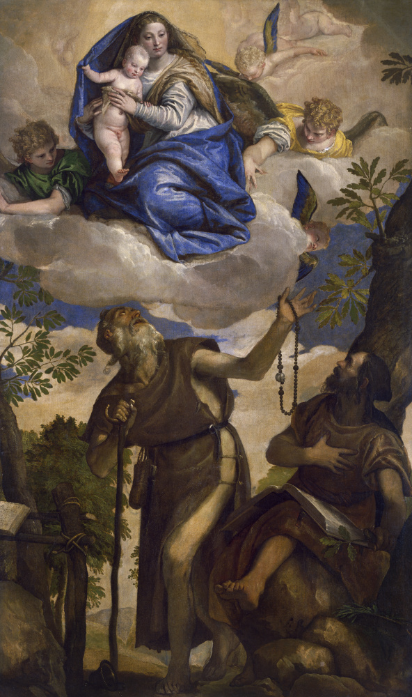
Paolo Veronese, (Italian, 1528–1588), The Virgin and Child with Angels Appearing to Saints Anthony Abbot and Paul, the Hermit, 1562, Oil on canvas, Chrysler Museum of Art, Norfolk, VA, Gift of Walter P. Chrysler, Jr., in Memory of Della Viola Forker Chrysler, 71.527
The Virgin and Child with Angels Appearing to Saints Anthony Abbot and Paul, the Hermit by Veronese showcases a lavish use of this precious blue pigment and illustrates its primary use in Catholic Early Modern Europe. Its great cost was used to confer status to the blue robes of the Virgin Mary. Thankfully, for those who could not afford to shower their painters with rains of gold, several other blue colors with less popularity have always existed. Even when ultramarine was employed, it was only as a thin final glaze with underpainting in azurite, smalt, or indigo.[8]
Competing for Second Best
Azurite was by far the most popular under layer for applying the gold-standard ultramarine blue upon.[9] Our Veronese is underpainted in azurite with ultramarine top layers, as seen in this cross-section.
The pigment had been used since antiquity and enjoyed enduring popularity. It’s less purple than ultramarine and often appears greyer or even green. Oddly, green skies can be a hallmark of azurite—the product of centuries of aging. Giovan Filippo Criscuolo’s Adoration of the Magi likely showcases this pigment in both the sky and the Madonna’s robes.
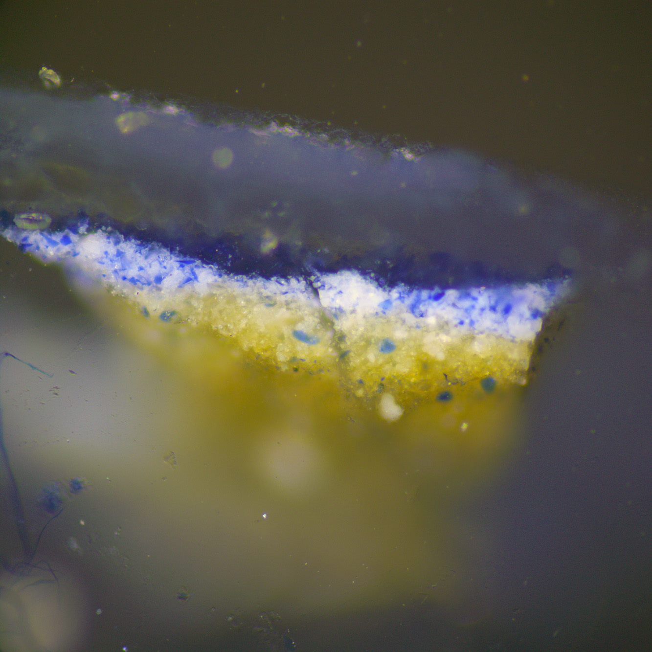
Cross section from Paolo Veronese’s The Virgin and Child with Angels Appearing to Saints Anthony Abbot and Paul, the Hermit
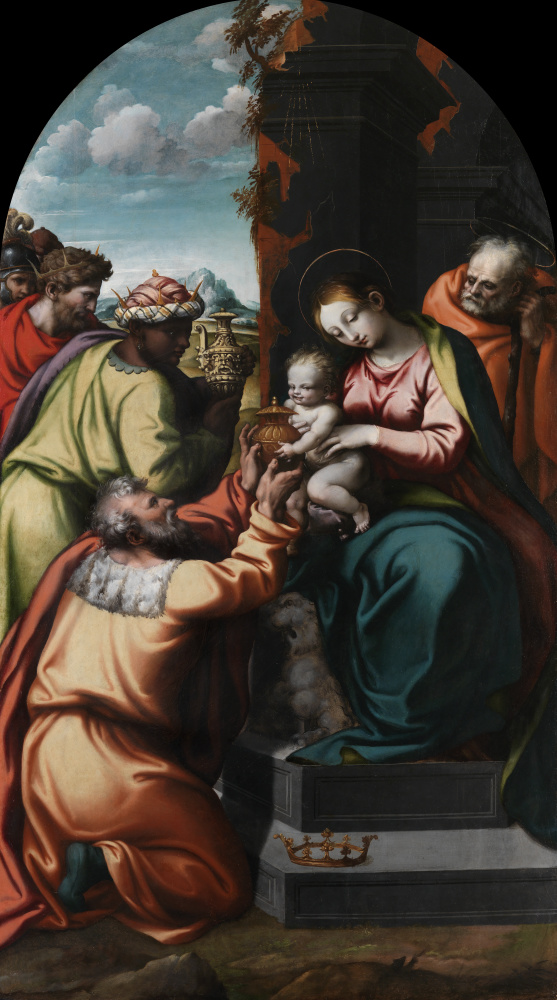
Giovan Filippo Criscuolo, (Italian, 1495-1584), Adoration of the Magi, ca. 1545, Oil on panel, Gift of Walter P. Chrysler, Jr., 78.294
The copper-based mineral is found across the world, but in the fifteenth century, azurite was mined mostly in what is now Hungary, in the same mines where much more profitable silver and copper were found. When the Spanish introduced vast sums of New World silver after 1523, miners were pressured to find other rare minerals that could not be undercut. As a result, azurite became scarcely available on the market. Instead, smalt, another blue, became the prevailing choice by 1550. The pigment was more readily available than semi-precious minerals because it was made of ground blue, cobalt oxide glass. In stained glass, it appears as a brilliant blue, as seen in our panel of Saint Nicholas, attributed to Guillaume Barbe. Once ground and mixed with oil, however, the pigment becomes much duller. Despite this, it was recommended as a replacement for azurite and ultramarine or used as an underpainting or even a final glaze.[10] By the seventeenth century, deteriorating global trade meant both azurite and ultramarine had become scarce and expensive pigments, leaving smalt as the only option for many painters.[11] The ground glass was readily available in Venice, the world’s hub of glass making, [12] and the Netherlands, where great quantities were used to give color to Delftware.[13]
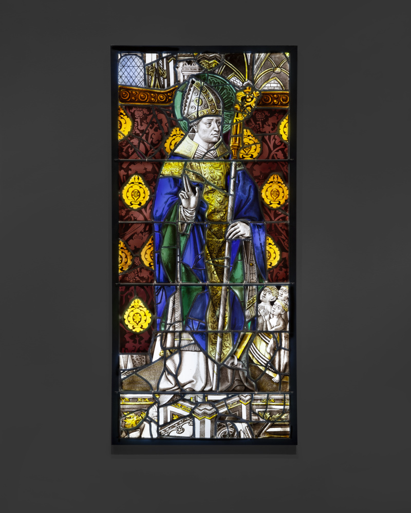
Saint Nicholas, (attributed to Guillaume Barbe, French, documented 1456–1488), ca. 1470, Glass with silver stain and vitreous enamel, 2019.36.1
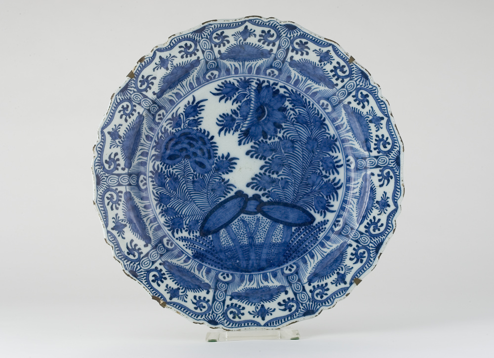
Justus Brouwer (Dutch), Charger, 1720, Delft, Gift of Walter P. Chrysler, Jr., 77.664
Smalt is likely at play in the lush blue sky of Bernardo Strozzi’s Martyrdom of Saint Justina (ca.1635), possibly with ultramarine glazes overtop. It’s a typical example of the lavish commissions that continued in parts of Catholic Europe into the seventeenth-century Reformation-Counter Reformation period. Its stunning scale (over seven feet tall) and exuberant use of color exemplifies the call to Catholic ideals and faith. Elsewhere, in the Dutch Netherlands for instance, the use of color in this period was extremely restrained. In the seventeenth century, the art market shifted toward the production of ready-made artworks for investment. In a market that prioritized profit, smalt became the most popular blue pigment, as it was the cheapest and most readily available in Holland. Spanish trade embargos and economic downturn after the Dutch Golden Age further secured the continued use of readily available smalt, distancing artists from azurite and ultramarine. The monochromatic style of Dutch painting is associated with this period, possibly inspired by a need to paint with economical earth colors and rapid technique. Rembrandt is a prime example of these painters. The history painter turned to portraiture of the Dutch middle class to keep his studio open. Rembrandt painted sublimely in sometimes nearly colorless palettes, as seen in Portrait of a Man by his studio. If he did use blue, Rembrandt almost exclusively used smalt.[14] [15]
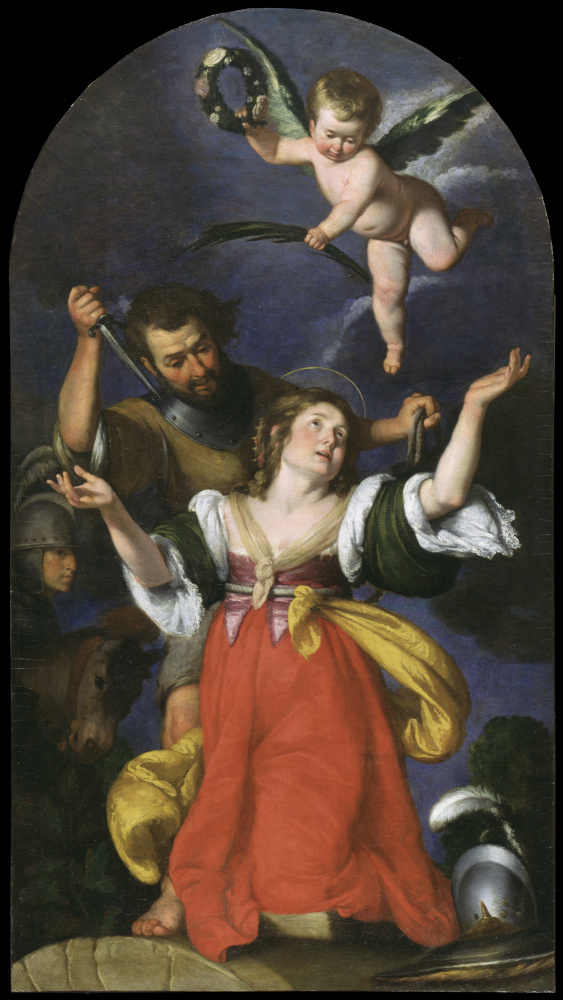
Bernardo Strozzi (Italian, 1581–1644), The Martyrdom of Saint Justina, ca.1635, Oil on canvas, Gift of Walter P. Chrysler, Jr., 71.526
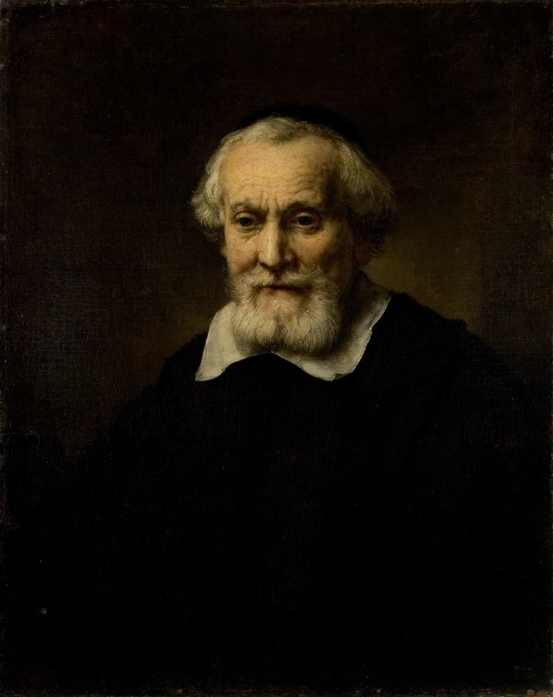
Studio of Rembrandt van Rijn (Dutch, 1606–1669), Portrait of a Man, ca. 1650, Oil on canvas, 0.3171
Today, indigo is one of the most popular blue pigments as the color of denim jeans. Historically, however, it appears to have enjoyed limited use in easel painting, being primarily found in seventeenth-century examples.[16] Indigo, in its pure form, is nearly black, can appear greenish, and when mixed with white readily becomes grey. It’s no wonder the color was described as foul in the eighteenth century (although this could also be due to its extraction in stale human urine). [17] After 1523, indigo was principally imported by the Spanish from the New World at a very economical cost.[18] In addition to utilizing enslaved labor, indigo pigments were a by-product of dying processes,[19] making the foul color readily available and even cheaper than smalt. The Renaissance greats Titian and Veronese are known to have utilized indigo as an underpainting; [20] however, these Venetian painters more commonly used smalt.[21]
The Eighteenth Century: Prussian Blue
The first major disruptor in the market for blue pigments came in the early-eighteenth century with the discovery of a new synthetic blue: Prussian blue. The deep, transparent blue was likely discovered by Johann Jacob Diesbach in Berlin in 1706. Although considered to be one of the first truly modern synthetic pigments, its recipe sounds like something from the Medieval alchemy lab. The pigment is iron-based, and this iron was originally sourced from the dried blood of cattle before being transfigured into brilliant blue with modern chemistry. [22]
Although Diesbach discovered the pigment, Johann Leonard Frisch saw the financial opportunities of the color. Frisch has been described as the precursor to a modern-day marketing rep. He was heavily invested in marketing and selling the new Prussian blue pigment and was likely critical to its widespread. By 1709, Frisch was sending samples to painters across Europe. [23] Prussian blue made it to Parisian painters by 1710 at the latest, where it was found in the works of masters like Watteau.[24]
Prussian blue became incredibly popular with artists and numerous other industries. It offered new, unrivaled working qualities. Prussian blue is deeply colored and statured, making it possible to mix a great number of colors from a single pigment. What made it unique was its ability to appear blue, despite having a very fine, powdery texture. In contrast, ultramarine, azurite, and smalt had to be ground coarsely else they would become uselessly grey. Because of its fine texture, Prussian blue made beautifully smooth and saturated paints, inks, and dyes that could be used in fine art, house painting, wallpaper, textiles, tri-color prints, and later cyanotypes. [25] [26] Prussian blue unquestionably decimated the use of smalt, azurite, and indigo in painting—not only because its color was considered superior but because its accessibility made for a near monopoly on the blue color market. The pigment was incredibly affordable because it relied only on readily available raw materials—a recipe unhindered by global trading politics, the success of mining operations, or the suitability of sailing conditions.[27] Production began in Paris quickly in the eighteenth century, and in England by 1724. It became a worldwide hit, making it to America, Siberia, and Japan by 1825. By the nineteenth century, Prussian blue became a by-product of coal-gas manufacture, likely making the pigment even more accessible [28]
The result of this market disruption is a diffusion of blue across the canvas. Where blue was once locally applied with great care, we see it utilized to create chromatic unity. Charles-Joseph Natoire’s Psyche Gathering the Fleece of the Rams of the Sun showcases this eighteenth-century spread of color, with a serenely blue tone that permeates across the whole canvas. More traditional painting styles also saw the enrichment of blue passages with richly saturated, jewel-like color as seen in Christ and the Canaanite Woman by Jean François de Troy.
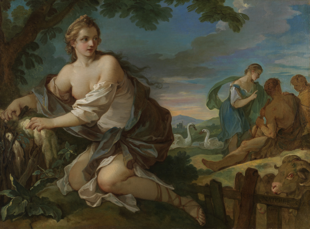
Charles-Joseph Natoire (French, 1700–1777), Psyche Gathering the Fleece of the Rams of the Sun, 1752, Oil on canvas, Gift of Walter P. Chrysler, Jr., 71.2241
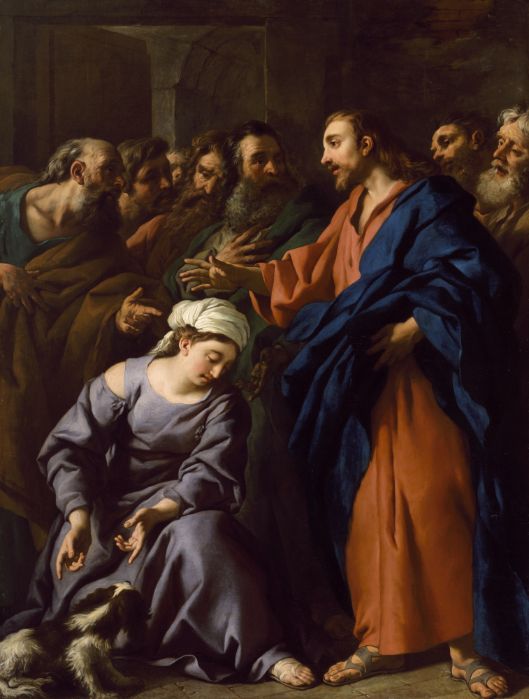
Jean François de Troy (French, 1679–1752), Christ and the Canaanite Woman, 1743, Oil on canvas, 69.34.6
The Nineteenth Century: Synthetic Ultramarine
Despite costing ten times the price, ultramarine blue remained the sole competitor of Prussian blue, for its beautiful hue was considered unreplaceable.[29] Unlike most blue pigments, ultramarine was not a copper or iron-based mineral but a complex alumino-silicate—like a gemstone. Because of its complex natural arrangement of atoms, it was impossible in the pre-Enlightenment era to determine what exactly made ultramarine blue and how to replicate it. However, ultramarine-like deposits were observed on the sides of soda and lime kilns, encouraging the possibility the famed pigment could be replicated by science. [30]
In 1824, French Societe d’Encouragement pour l’Industrie Nationale put out a prize to anyone who could affordably develop the synthesis of ultramarine blue. Between 1826 and 1828, three means of making artificial ultramarine were found independently—but in 1828, the Parisian Jean Baptiste Guimet ultimately claimed the prize. Guiment’s French ultramarine cost approximately 100 times less than the real mineral. Guimet even sent his first sample to Ingres for testing in 1827 before claiming his prize, garnering the approval of the world’s leading academic artist. Winsor and Newton offered the color in oil and watercolor in 1832, with many others following suit.[31]
Guimet was a shrewd businessman. He knew that there was little money to be made in artists’ materials, and he had to compete with the still cheaper smalt for the market on cheap blue used for the industrial process of printing and blueing. It took another producer, Carl Leverkus, entering the market at the end of the 1830s to succeed at truly producing ultramarine on a mass industrial scale. The market snowballed from there. By 1851, the pigment once as costly as gold was cheap enough to use as laundry blueing. By the 1870s, more than thirty firms across the globe produced a total of ten million kilos annually. [32]
The new accessibility of synthetic French ultramarine greatly changed the course of art, just as Prussian blue did. A pigment that remained exceedingly costly, even into the industrialized nineteenth century, suddenly became widely available to any artist. By this time, the business of art had also become closer to that of the Art world we know today—with many artists producing the works they wanted to with hopes of finding a patron or buyer to support their unique artistic genius. The stereotype of the starving artist derives from Impressionists of this era like Camille Pissarro, who was famously poor.
With works being made on speculation or for mere artistic exploration, the availability of cheap, accessible color was critical to the Impressionists—especially blue that was so commonly used in shadows where black and brown were previously used. Synthetic ultramarine became a staple of the Impressionists’ palette along with new cobalt and cerulean blues.[33] Ker-Xavier Roussel’s The Fountain of Youth is the Chrysler’s best example of synthetic ultramarine from this period. The blue sky is unmistakably the distinctive shade of ancient blue. The use of tempera as a medium further harkens back to techniques referenced in Renaissance painting. The dry nature of the medium was used to keep the blue as bright and colorful as possible when applied. The effect here is certainly evident, with a nearly electric appearance.
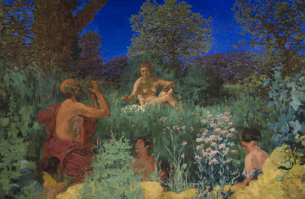
Ker-Xavier Roussel (French, 1867–1944), The Fountain of Youth, ca. 1924, Oil and tempera on canvas, Gift of Walter P. Chrysler, Jr. © Artists Rights Society (ARS), New York, 71.701
The Twentieth Century: Pthalo Blue
Despite the wide dissemination of what seemed like the perfect blue, French ultramarine does not reign supreme today. A new synthetic pigment, pthalo blue, has now become the choice pigment. Pthalo pigments account for 90–95% of the blue and green pigments used in paint, inks, and plastics—in excess of millions of tons per year.[34] The pigment is cheap, excellently lightfast, chemically stable, and intensely colored, making it ideal for industrial and artistic use. Pthalo blue was first discovered in 1927 and introduced to artists through Winsor and Newton in 1937. The incredible covering power of pthalo blue likely helped Roy Lichtenstein to keep his paint layers thin, opaque, and saturated in works like Live Ammo.
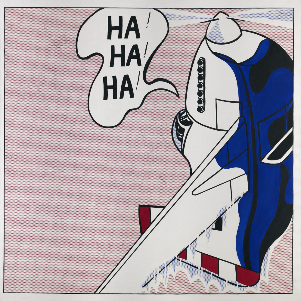
Roy Lichtenstein (American, 1923–1997), Live Ammo (Ha! Ha! Ha!), 1962, Oil on canvas, © Roy Lichtenstein Foundation, 71.676
Thanks to the advances in industrial chemistry of the twentieth century and the demand for colorants, particularly in the new bourgeoning automotive industry, blue and a long list of other colors became readily accessible to all who wished to paint in color. What once cost as much as gold is now accessible to all artists who wish to express themselves, exemplified by the much-cited fact that blue is the world’s favorite color.
Join us next week for the story of black, From the Shadows to the Foreground: Black Pigments and the Fight for Equal Rights in Western Art.
–Brandon Finney, NEH Conservation Fellow
BIBLIOGRAPHY
Bartoll, Jen, ‘The Early Use of Prussian Blue in Paintings’, in 9th International Conference on NDT of Art (Jerusalem: NDT.net, 2008)
Berrie, Barbara, ‘Prussian Blue’, in Artists’ Pigments: A Handbook of Their History and Characteristics. Volume 3 (Washington DC: National Gallery of Art, 1997)
Berrie, Barbara H, ‘Mining for Color: New Blues, Yellows, and Translucent Paint’, Early Science and Medicine, 20.4/6 (2015), 308–34 <http://www.jstor.org/stable/24760385>
Gettens, Rutherford J, and Elisabeth West FitzHugh, ‘Azurite and Blue Verditer’, in Artists’ Pigments: A Handbook of Their History and Characteristics. Volume 2 (Washington DC: National Gallery of Art, 1993)
Israel, Jonathan, ‘Adjusting to Hard Times: Dutch Art during Its Period of Crisis and Restructuring (c. 1621–c. 1645)’, Art History, 20.3 (1997), 449–76 <https://doi.org/10.1111/1467-8365.00071>
Jezequel, Pierre, Guillaume Wille, Claire Beny, Fabian Delorme, Veronique Jean-Prost, Roger Cottier, and others, ‘Characterization and Origin of Black and Red Magdalenian Pigments from Grottes de La Garenne (Vallée Moyenne de La Creuse-France): A Mineralogical and Geochemical Approach of the Study of Prehistorical Paintings’, Journal of Archaeological Science, 38.6 (2011), 1165–72 <https://doi.org/10.1016/j.jas.2010.12.014>
Lomax, Suzanne Quillen, ‘Phthalocyanine and Quinacridone Pigments: Their History, Properties and Use’, Studies in Conservation: Reviews in Conservation 6, 50.sup1 (2005), 19–29 <https://doi.org/10.1179/sic.2005.50.Supplement-1.19>
Mertens, Joost, ‘The History of Artificial Ultramarine (1787–1844): Science, Industry and Secrecy’, Ambix, 51.3 (2004), 219–44 <https://doi.org/10.1179/amb.2004.51.3.219>
Mühlethaler, Bruno, and Jean Thissen, ‘Smalt’, in Artists’ Pigments: A Handbook of Their History and Characteristics. Volume 2 (Washington DC: National Gallery of Art, 1993)
Orna, Mary Virginia, Manfred J D Low, and Norbert S Baer, ‘Synthetic Blue Pigments: Ninth to Sixteenth Centuries. I. Literature’, Studies in Conservation, 25.2 (1980), 53–63 <https://doi.org/10.1179/sic.1980.25.2.53>
Penny, Nicholas, Jill Dunkerton, Marika Spring, Rachel Billinge, Helen Howard, Gabriella Macaro, and others, ‘Titian’s Painting Technique from 1540’, National Gallery Technical Bulletin, 36 (2015), 1–136 <http://www.jstor.org/stable/44678399>
Penny, Nicholas, And Marika Spring, ‘Veronese’s Paintings in the National Gallery Technique and Materials: Part I’, National Gallery Technical Bulletin, 16 (1995), 4–29 <http://www.jstor.org/stable/42616091>
Plesters, Joyce, ‘Ultramarine Blue, Natural and Artificial’, in Artists’ Pigments: A Handbook of Their History and Characteristics. Volume 2 (Washington DC: National Gallery of Art, 1993)
de Roo, Mira, ‘The Trade in Blue During the 17th Century : An Examination of the Western European Pigment Trade in Azurite, Indigo, Lapis Lazuli and Smalt during the 17 Th Century through Works in the Collection of the National Gallery, London’, 2004 <https://doi.org/10.13140/RG.2.2.23020.36488>
Schweppe, Helmut, ‘Indigo and Woad’, in Artists’ Pigments: A Handbook of Their History and Characteristics. Volume 3 (Washington DC: National Gallery of Art, 1997)
Spear, Richard E, ‘Scrambling for Scudi: Notes on Painters’ Earnings in Early Baroque Rome’, The Art Bulletin, 85.2 (2003), 310–20 <https://doi.org/10.2307/3177346>
Vazquez de Agredos Pascual, Maria Luisa, Ma Domenech Carbo, Dolores Julia Yusa Marco, Sofia Vicente Palomino, and Laura Fuster Lopez, ‘Kermes and Cochineal; Woad and Indigo. Repercussions of the Discovery of the New World in the Workshops of European Painters and Dyers in the Modern Age’, Arché, 2, 2007, 131–36
Zoriana, L., ‘Blue in Eighteenth-Century England: Pigments and Usages’, XVII-XVIII, 2018 <https://doi.org/10.4000/1718.1214>
[1] Mary Virginia Orna, Manfred J D Low, and Norbert S Baer, ‘Synthetic Blue Pigments: Ninth to Sixteenth Centuries. I. Literature’, Studies in Conservation, 25.2 (1980), 53–63 <https://doi.org/10.1179/sic.1980.25.2.53>.
[2] Mira de Roo, ‘The Trade in Blue During the 17th Century : An Examination of the Western European Pigment Trade in Azurite, Indigo, Lapis Lazuli and Smalt during the 17 Th Century through Works in the Collection of the National Gallery, London’, 2004 <https://doi.org/10.13140/RG.2.2.23020.36488>.
[3] Joyce Plesters, ‘Ultramarine Blue, Natural and Artificial’, in Artists’ Pigments: A Handbook of Their History and Characteristics. Volume 2 (Washington DC: National Gallery of Art, 1993).
[4] de Roo.
[5] Plesters.
[6] Plesters.
[7] Richard E Spear, ‘Scrambling for Scudi: Notes on Painters’ Earnings in Early Baroque Rome’, The Art Bulletin, 85.2 (2003), 310–20 <https://doi.org/10.2307/3177346>.
[8] Plesters.
[9] Rutherford J Gettens and Elisabeth West FitzHugh, ‘Azurite and Blue Verditer’, in Artists’ Pigments: A Handbook of Their History and Characteristics. Volume 2 (Washington DC: National Gallery of Art, 1993).
[10] Barbara H Berrie, ‘Mining for Color: New Blues, Yellows, and Translucent Paint’, Early Science and Medicine, 20.4/6 (2015), 308–34 <http://www.jstor.org/stable/24760385>.
[11] Bruno Mühlethaler and Jean Thissen, ‘Smalt’, in Artists’ Pigments: A Handbook of Their History and Characteristics. Volume 2 (Washington DC: National Gallery of Art, 1993).
[12] Nicholas Penny and Marika Spring, ‘Veronese’s Paintings in the National Gallery Technique and Materials: Part I’, National Gallery Technical Bulletin, 16 (1995), 4–29 <http://www.jstor.org/stable/42616091>.
[13] Mühlethaler and Thissen.
[14] de Roo.
[15] Jonathan Israel, ‘Adjusting to Hard Times: Dutch Art during Its Period of Crisis and Restructuring (c. 1621–c. 1645)’, Art History, 20.3 (1997), 449–76 <https://doi.org/10.1111/1467-8365.00071>.
[16] Helmut Schweppe, ‘Indigo and Woad’, in Artists’ Pigments: A Handbook of Their History and Characteristics. Volume 3 (Washington DC: National Gallery of Art, 1997).
[17] L. Zoriana, ‘Blue in Eighteenth-Century England: Pigments and Usages’, XVII-XVIII, 2018 <https://doi.org/10.4000/1718.1214>.
[18] Maria Luisa Vazquez de Agredos Pascual and others, ‘Kermes and Cochineal; Woad and Indigo. Repercussions of the Discovery of the New World in the Workshops of European Painters and Dyers in the Modern Age’, Arché, 2, 2007, 131–36.
[19] Penny and Spring.
[20] Nicholas Penny and others, ‘Titian’s Painting Technique from 1540’, National Gallery Technical Bulletin, 36 (2015), 1–136 <http://www.jstor.org/stable/44678399>.
[21] Pierre Jezequel and others, ‘Characterization and Origin of Black and Red Magdalenian Pigments from Grottes de La Garenne (Vallée Moyenne de La Creuse-France): A Mineralogical and Geochemical Approach of the Study of Prehistorical Paintings’, Journal of Archaeological Science, 38.6 (2011), 1165–72 <https://doi.org/10.1016/j.jas.2010.12.014>.
[22] Barbara Berrie, ‘Prussian Blue’, in Artists’ Pigments: A Handbook of Their History and Characteristics. Volume 3 (Washington DC: National Gallery of Art, 1997).
[23] Jen Bartoll, ‘The Early Use of Prussian Blue in Paintings’, in 9th International Conference on NDT of Art (Jerusalem: NDT.net, 2008).
[24] Bartoll.
[25] Barbara Berrie.
[26] Zoriana.
[27] Zoriana.
[28] Barbara Berrie.
[29] Zoriana.
[30] Joost Mertens, ‘The History of Artificial Ultramarine (1787–1844): Science, Industry and Secrecy’, Ambix, 51.3 (2004), 219–44 <https://doi.org/10.1179/amb.2004.51.3.219>.
[31] Plesters.
[32] Mertens.
[33] Plesters.
[34] Suzanne Quillen Lomax, ‘Phthalocyanine and Quinacridone Pigments: Their History, Properties and Use’, Studies in Conservation: Reviews in Conservation 6, 50.sup1 (2005), 19–29 <https://doi.org/10.1179/sic.2005.50.Supplement-1.19>.