- Open today, 10 am to 5 pm.
- Parking & Directions
- Free Admission

June 11, 2020
The History of Art in Colors
Green–A Sickly Shade
Green is perhaps one of the most contradictory and problematic colors. The color of a joyous landscape on a sunny day, the succulent on your desk, and the greens in your salad is, at the same time, the most unnatural and dangerous color. Green is the color of poison, the marker of envy, and the signature shade of the House of Slytherin. Green has long been a suspect and difficult color, and these challenges find their way into the history of painting.
Verdigris and Resinate: Cultivating Corrosion
Verdigris was the most intense green pigment available from the fifteenth to the seventeenth century—its chroma unmatchable by mixtures of blue and yellow or even the brilliant green mineral malachite. It’s easy to spot this colorful pigment in the green robes of St. John in our Last Judgement by Marx Reichlich (ca.1490). This pigment was the colorful corrosion product of copper in contact with acetic acid (white vinegar). Despite its brilliance, verdigris presented significant working challenges to the painter. Copper corrosion products are not chemically stable, so verdigris paint often underwent a color shift from blue-green to true green during the first few months of its life.[1] If mixed with sulfurous pigments like orange orpiment, the paint could blacken.[2]
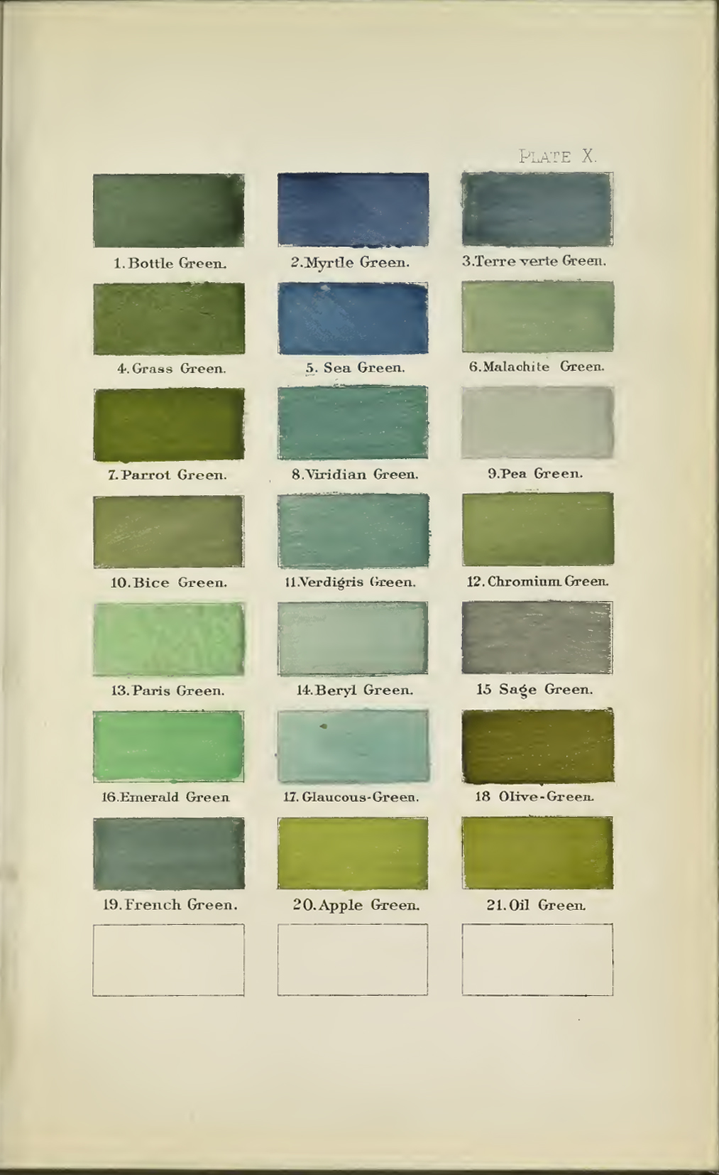
Page from A nomenclature of colors for naturalists: and compendium of useful knowledge for ornithologists showing a still blue-green verdigris. By Ridgway, Robert, 1886. Image via Archive.org courtesy of the Boston Public Library.
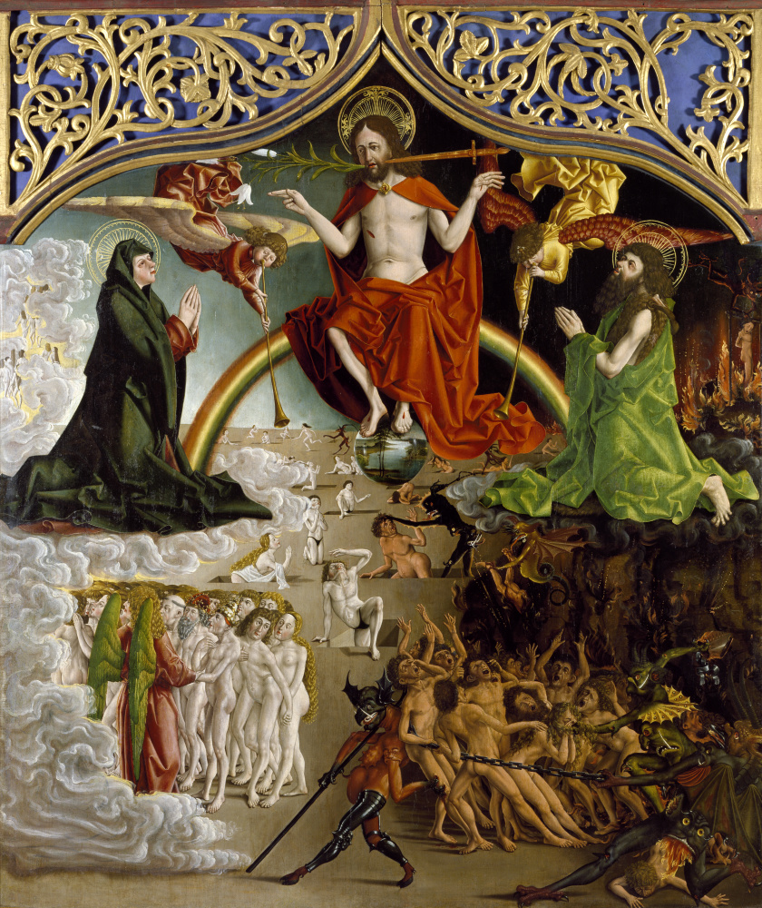
Marx Reichlich (South German, active ca. 1485–1520), Last Judgement, ca. 1490, Oil and tempera on wood, Gift of Walter P. Chrysler, Jr., 71.3098
Because of its difficult working properties, verdigris was often applied as an underlayer and modified with separate glazes of other colors like copper resinate. Copper resinate was made by mixing verdigris with hot liquid tree resin (like Venice turpentine). It was found that the copper corrosion products would dissolve and form a new product: a beautifully rich, deep, forest green. When mixed with drying oil, the green resin could be used as a jewel-toned glaze.[3] The glaze was popular in Flemish and Italian Renaissance works, as seen on the cloak of Mary Magdalene in our Crucifixion by Master of the Virgo inter Virgines (ca. 1480). Unfortunately, as with verdigris, the new product proved unstable. Copper resinate very slowly shifts from green to dark brown due to exposure to UV light, moisture, and atmospheric pollution. Technical analysis confirmed that our Allegorical Figure of Spring by Tintoretto was glazed with copper resinate, which explains the dark brown state of the painting that was likely intended to be a much brighter representation of springtime foliage.[4]

Master of the Virgo inter Virgines (Netherlandish, active ca. 1475–1500), Crucifixion, ca. 1480, Oil on panel, Bequest of Walter P. Chrysler, Jr., 89.57
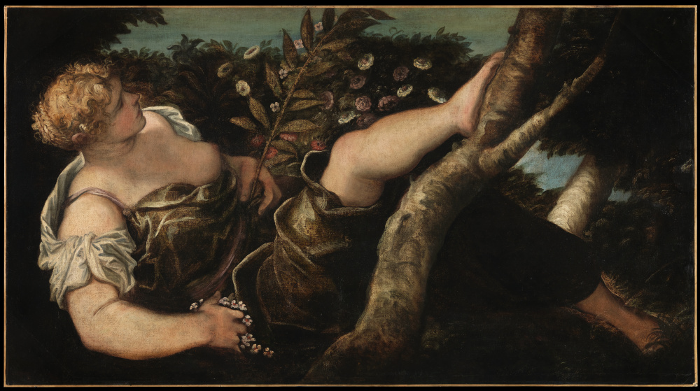
Jacopo Robusti (Tintoretto) (Italian, 1519–1594), Allegorical Figure of Spring, ca. 1546-–1548, Oil on canvas, Gift of Walter P. Chrysler, Jr., 71.1301
Blue and Yellow Make Green Blue
Without an ideal green pigment, artists utilized mixed greens— mixtures of blue with often-ephemeral yellow pigments like Indian yellow—to achieve natural greens with transparency and richness. These mixtures also came with their own issues. Over time—often with exposure to sunlight—the yellow pigments faded, leaving behind only the more stable blue color. Sixteenth-century tapestries, like our Anointing of David, and Old Master still lifes, like this floral work from the Ashmolean Museum, showcase this effect with oddly blue foliage.
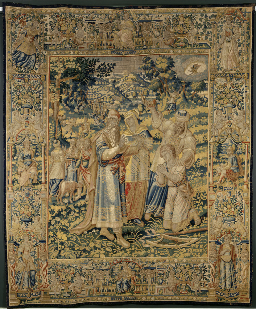
The Anointing of David. Flemish, late 1500s. Wool and silk. Gift of the Irene Leache Memorial Foundation, in memory of Sally G. Shepherd. Conserved with funds generously provided by the Camp Foundation, the Irene Leache Memorial, and by Virginia Shepherd Ferguson, Lemuel Cornick Shepherd, Wilson E. Driver Shepherd, Virginia Shepherd Ord, and Edith Brooke Robertson, 2014.3.18
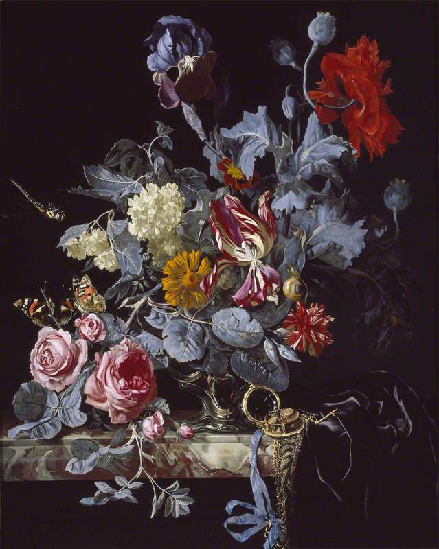
Style of Willem van Aelst, A Vase with Flowers and A Watch. 1642–1683, Image courtesy of the Ashmolean Museum, Oxford, UK via WikiArt
Because no alternatives existed, the practice of mixing greens from blue and yellow pigments continued well into the eighteenth century. This stagnation allowed a new, notorious color—arsenic green—to gain an incredibly strong foothold on Western society.
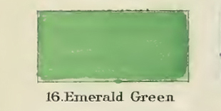
Emerald Green: A Celebrated Discovery
The first of these green hues, Sheele’s green, was invented in 1775 by the Swedish chemist of the same name. This brilliant green was made of copper arsenite, a completely manmade compound. The color became incredibly popular both in commercial applications like wallpapers and in artists’ materials. The even-more-ubiquitous emerald or Paris green (copper-acetoarsenite) was introduced between 1800–1814 as an attempt to improve Sheele’s green. This was the first totally synthetic, stable green. Its color was said to be balanced and brilliant, not too blue or yellow, and akin to the green of natural foliage.[5]
Detail from A nomenclature of colors for naturalists: and compendium of useful knowledge for ornithologists. By Ridgway, Robert, 1886. Image via Archive.org courtesy of the Boston Public Library.
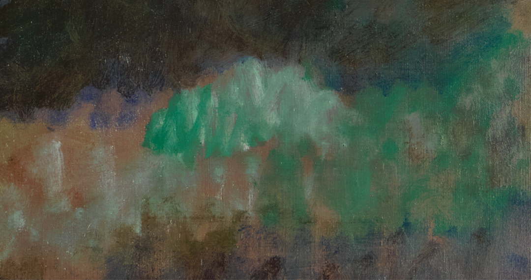
As a color, emerald green typifies the nineteenth century, transcending boundaries between Academic traditions, Victorian fashions, and the new schools of Symbolism and Impressionism. In addition to other new colors introduced at the turn of the nineteenth century, the brilliant emerald green allowed artists to paint in completely new modes. Where the Old Masters would have had to plan layers of undercolor and glazing to achieve a similar vibrancy of color, the painters of the nineteenth century were able to paint freely from their palettes in expressive and gestural manners. Painters like Paul Gauguin and Edgar Degas utilized emerald green to add intensely chromatic splashes of green to their compositions, as likely seen in Degas’s Dancer with Bouquets (1895–1900). Other painters like Henri Edmond Cross likely exploited the color’s incredibly rich chroma to create the light and colorful landscape of Excursion (1895), filled with intensely cool, rich greens.
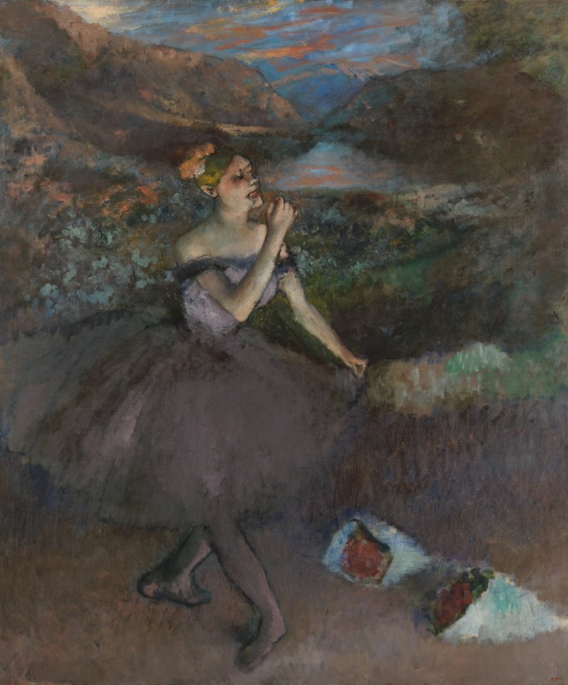
Edgar Degas (French, 1834–1917), Dancer with Bouquets, 1895–1900, Oil on canvas, Gift of Walter P. Chrysler, Jr., in memory of Della Viola Forker Chrysler, 71.507 (and detail below from same showing likely use of arsenic based green)
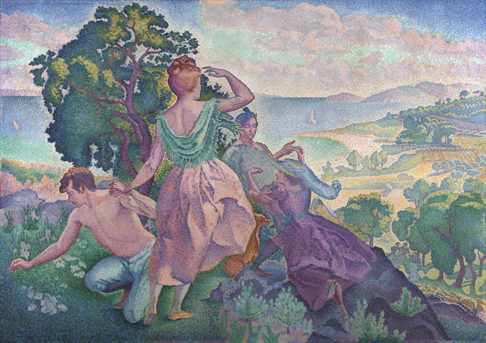
Henri Edmond Cross (French, 1856–1910), Excursion, 1895, Oil on canvas, Gift of Walter P. Chrysler, Jr., 77.416
Arsenic Green: Pretty & Poisonous
The much-beloved arsenic greens were quickly recognized as highly toxic in the nineteenth century, used industrially as insecticide and rat poison. Despite this, its economical cost and enticing shade meant that the pigment stayed wildly popular for over a century, used in clothes, fake flowers, toys, candy wrappers, and even “edible” confections.[6] Spurred by stories of harrowing medical conditions and deaths, fear of green and colorful fashions eventually pervaded Victorian society.[7] By the turn of the century, the aesthetic ideal for muted shades in both art and fashion had taken hold, likely in part driven by the suggestion that uncolored clothing would not kill the wearer.[8] American painters like James Abbott McNeill Whistler and Susan Watkins would showcase this new trend, as seen in Marguerite (ca. 1906).
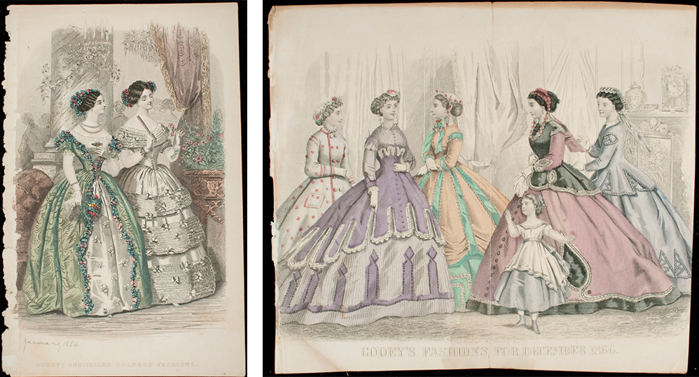
(Left) Illman & Sons (American, 19th century), Godey’s Unrivaled Colored Fashions, 1854, Engraving, Gift of Ms. Anne Rowland, 79.210.174
This engraving depicts what is likely an arsenic green dress amongst a lush spread of arsenic green dusted fake flowers.
(Right) Kimmel & Forster (American, 1865–1866), Godey’s Fashions for December, 1866, Engraving, Gift of Ms. Anne Rowland, 79.210.189
This engraving showcases the colorful fashions of the mid-century, including the unmistakable Mauvine purple and bright emerald green. The pigments used in these watercolors are potentially arsenic-based emerald green as well.
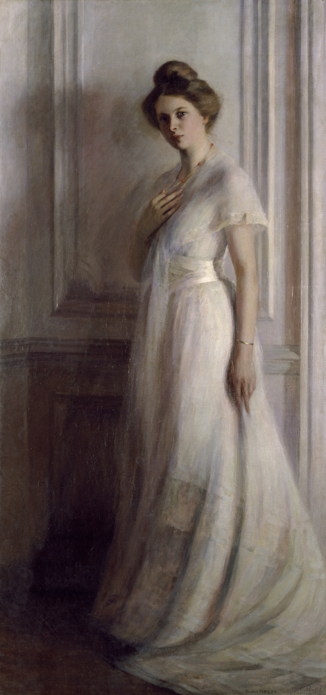
Susan Watkins (American, 1875–1913), Marguerite, ca. 1906, Oil on canvas, Bequest of Goldsborough Serpell, 46.76.146
While green dresses had long disappeared, arsenic green paints remained in use until the 1960s when synthetic phthalo dye colors were employed as replacements for the brilliant green hue.[9] We probably now take for granted the ability to enjoy a green beer on Saint Patrick’s Day without succumbing to arsenic poisoning or the opportunity to paint with permanent green pigments that won’t turn brown and black with age, for green truly used to be a sickly shade.
Join us next week as we “dye-ve” into the history of red: the surprisingly story of insects, war, and piracy.
[1] Herman Kuhn, ‘Verdigris and Copper Resinate’, in Artists’ Pigments : A Handbook of Their History and Characteristics. Vol. 2, ed. by Robert L Feller and others (Washington: National Gallery of Art, 1986), pp. 131–58.
[2] Sarah Horn, ‘Discoloration of a Green Pigment in Tintoretto’s “Allegorical Figure of Spring” and Analysis of the Chemical Properties and Stability of Copper Resinate’, ed. by Craig Bayse and others (ProQuest Dissertations Publishing, 2016).
[3] Kuhn.
[4] Horn.
[5] Ingle Fielder and Michael Bayard, ‘Emerald and Sheele’s Green’, in Artists’ Pigments : A Handbook of Their History and Characteristics. Vol. 3, ed. by Robert L Feller and others (Washington: National Gallery of Art, 1986), pp. 219–72.
[6] Fielder and Bayard.
[7] Alison Matthews. David, ‘Poisonous Pigments: Arsenical Greens’, in Fashion Victims : The Dangers of Dress Past and Present (London: Bloomsbury Visual Arts, 2017), pp. 72–101.
[8] Alison Matthews David, ‘Tainted Love: Oscar Wilde’s Toxic Green Carnation, Queerness, and Chromophobia’, in Colors in Fashion, ed. by Jonathan Faiers and Mary Westerman Bulgarella, Paperback (London: Bloomsbury Visual Arts, 2018), pp. 127–42.
[9] Fielder and Bayard.
Bibliography
David, Alison Matthews., ‘Poisonous Pigments: Arsenical Greens’, in Fashion Victims : The Dangers of Dress Past and Present (London: Bloomsbury Visual Arts, 2017), pp. 72–101
David, Alison Matthews, ‘Tainted Love: Oscar Wilde’s Toxic Green Carnation, Queerness, and Chromophobia’, in Colors in Fashion, ed. by Jonathan Faiers and Mary Westerman Bulgarella, Paperback (London: Bloomsbury Visual Arts, 2018), pp. 127–42
Fielder, Ingle, and Michael Bayard, ‘Emerald and Sheele’s Green’, in Artists’ Pigments : A Handbook of Their History and Characteristics. Vol. 3, ed. by Robert L Feller, Ashok. Roy, Elisabeth West. FitzHugh, and Barbara Hepburn. Berrie (Washington: National Gallery of Art, 1986), pp. 219–72
Horn, Sarah, ‘Discoloration of a Green Pigment in Tintoretto’s “Allegorical Figure of Spring” and Analysis of the Chemical Properties and Stability of Copper Resinate’, ed. by Craig Bayse, John Cooper, Anne Muraoka, and Bala Ramjee (ProQuest Dissertations Publishing, 2016)
Kuhn, Herman, ‘Verdigris and Copper Resinate’, in Artists’ Pigments : A Handbook of Their History and Characteristics. Vol. 2, ed. by Robert L Feller, Ashok. Roy, Elisabeth West. FitzHugh, and Barbara Hepburn. Berrie (Washington: National Gallery of Art, 1986), pp. 131–58